Key Principles
- Draw, Work By Hand
- Utilize Your Creative Brain
It is essential to use a sketchbook or RVJ to document all of your ideas and developmental aspects of research when working on a project. It allows you to create a process using visual imagery that expresses your feelings, thoughts, inspiration and imagination that is contained in a book.
Draw, Work By Hand
Drawing and working by hand is a crucial aspect of creating your RVJ as it allows you to engage a physical connection through drawing, rough sketches and consistent doodles; which are all a part of of your personal creative thinking. Its also a way to show your developmental process, and using visual imagery to document different types of research allows you to use other artists work and style as inspiration to develop your own artistic style.
However, documenting your ideas and progress in the RVJ is vital in the way of recording, it is also very important to be consistent in your development. Your findings must be organised in some way so the viewer understands the development as it progresses. Projects should be clearly separated and explained thoroughly.
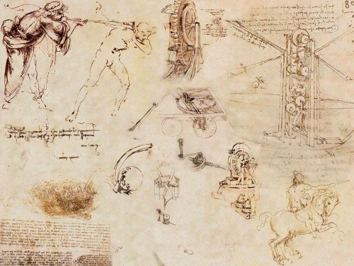
Leonardo Da Vinci is a legendary artist, his work have inspired many to create new and interesting forms of art.The piece above is a excellent example of creative thinking on paper. His sketches are quick but decisive; full of inventions, imaginative drawings and possible speculations of designs for machinery and various interesting products. His style is entirely committed to visual recording and creating development by drawing. Drawing is a way of transferring your ideas from your complex imagination and onto paper making it understandable for the reader and hopefully allowing them to gain a better insight into your personal style and way of thinking. By sketching and jotting down any ideas and developmental work; you are able to create a way to correct any problems or queries you have in the form of visual problem solving.
Your imagination never stops, because you are always thinking, so your mind is free to explore all possibilities and not limit yourself in your creative thinking.It is important to not forget your own judgement and to stop your inner child from exploring and imagining, because there are no barriers between child's play or mark making.
Lizzie Finn
Lizzie Finn has a very unique style of art; she uses a combination of sketches and fabrics along with a variety of decorative techniques within her work. She is able to produce very interesting imaginative pieces because she can work using a wide range of materials and mediums. She also seems to be able to experiment freely and enjoy the work she is creating, it is also and excellent method of creating developmental work based on basic ideas because the combination of sketches and fabric adds a unique twist to the work; even if its the most simple design.
Utilize Your Creative Brain
Learning how to manage your imagination and understand your ideas is extremely useful because it helps with your creative development, it also benefits you time management skills and it helps with your creative process.
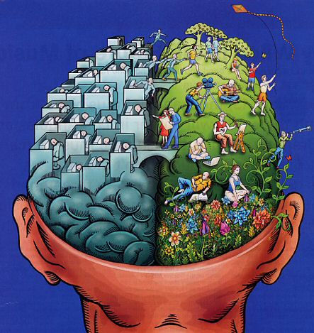
Our brain consists of two halves, the left and the right. Each side has special specific skills and abilities and the amazing way they function together enables us to understand what's actually going on.
Left Brain 'accountant' analyse
what is useful,? is it appropriate?
Analytical, observant, sensible, curious, enquiring, clarifying
Right Brain 'child' experimental play
play, fun, adventure, spontaneous, imaginative, carefree, experimental, innocent, curious etc.
I have inserted the images above as an example of the right and left brain, and the possible outcomes of the artistic talent of both sides.
We all can remember being a child, young and free to do whatever you wished. Everything we created was imaginative and freely expressed; when we were fully engaged with something to the point where nothing can distract us from our task; our inner child is allowed to roam free be as imaginative as possible at times where our left brain will encourage us to be cautious and more sensible about the content and presentation of our work.
The two halves of our brain function perfectly together, allowing us to think of imaginative outcomes and ideas. Being aware of which side of the brain we are operating in at each time is particularly useful because we then learn to utilize what is important, what has to be done next, and how to manage the entire project successfully. We constantly switch the sides of the brain we use at any one time; left to right, right to left, which allows us to ask ourselves questions about our work and figure out imaginative solutions to any problems we may face.
Saturday, 27 November 2010
Monday, 25 October 2010
PART 1 - CONNECTIVITY
Notions of originality
Where do we draw the line when stealing someone's ideas?
Key Principles
• Notions of Originality
• Can recontextualised ideas be contemporary.
From a very young age we are taught how to observe and imitate artists throughout history, especially during our school education. We learn t do this by recreating the works and practises of artists who inspire and us and enable us to develop a personal style of our own.
In order to find any piece of historic art work that we could truly call original we would have to research back centuries; back to the time when the idea was fresh and new.
Lucas Cranach - Adam and Eve – c.1520’s
I have decided to use this image as an example of the notions of originality. The piece consists of Adam, Eve in the garden of Eden; the atmosphere of this piece is extremely calm and peaceful and I believe that this piece could be used to tell a story. This image has been recreated and modernized throughout the years but I believe that this may actually be the original. The calm atmosphere of this piece is quite inviting and encourages you to relax.
This is a image of the front cover of a magazine with a re-contextualised version of the above image. The colours are a lot more vibrant and eye catching to draw the viewer into the image and invite them to read the rest of the magazine. Even though the original image features animals around the figures of Adam and Eve, the magazine cover looks a lot more crowded. There is definitely a lot going on in this piece, I think that the atmosphere of this image is quite lively; even though the pose used is similar to the original image; there is a sense of movement or activity behind the camera.
Can Re-Contextualised Ideas be Contemporary?
I believe that re contextualised ideas can indeed be contemporary; depending on which medium is used so that connects it to today's society and culture.
Over the years, our technology has developed dramatically into a extremely powerful force. Technology is the new tool which allows us to push the boundaries of re-contextualised ideas.
Fashion is a form of art, trends go in and out of fashion, and most of the time they are re-visited throughout different generations and times, For example, Pop art, inspired by Andy Warhol is used again and again in many advertisements and works of art. Most modern designers re-vamp these sort of styles and use the inspiration to create their own personal style that they use to create a name for themselves in the advertising industry.
PART 1 - ITAP Lecture 3 Colette
>Key Principles
Legibility
- Legibility
- Visual Hierarchy
There are actually two types of type.
Text Type is designed to be legible and readable across a variety of sizes.
Display Type is designed to attract attention and pull the reader into the text. It can be more elaborate, imaginative, and have a stylish look.
Is the type on you have chosen legible?
Is it readable?
Do people have difficulty understanding your type?
I have inserted the image above as an example of illegible text; I found these newspaper articles by using the google search engine. I think that the text is illegible because the type face is an inappropriate size which makes is quite difficult to decipher and understand. The layout has been created to look very compact which could make the reader quite frustrated.
Most newspaper articles choose to stick to black and white colour because it is the most common and a well known combination. However, in this case, the black and white colour only adds to the reader's confusion, the letters look very jumbled together.
The above image shows an article that I consider to be legible because it is clear and easy to read. The article has been put together with the reader in mind, it even includes an image that provides visual stimulation that would encourage the viewer to read on. The bold type face immediately draws the reader into the article; as does the image used. I believe that all of the aspects of this article is indeed appropriate for the intended purpose.
Visual Hierarchy
The examples used above lead me to my second key point in this blog; Visual Hierarchy simply means what we do and see first. Visual Hierarchy, what is in the background of the piece and the foreground as well as focusing on the main subject of the piece.
Below I have inserted an example of Visual Hierarchy.
Vogue magazine covers are an excellent example of Visual Hierarchy because the readers attention is drawn; first and foremost to the image of Penelope Cruz, against the white background she almost jumps off the page to catch the viewers attention. The type face on this cover is very bold and eventually captures the readers attention, the cover looks very lively and I believe that it aims to target a young audience of mainly woman and teenagers and fashion figures.
Sunday, 24 October 2010
PART 1 -Research and Development from an Illustration perspective
Five key principles
• Research: Through the ‘visual practice’ of observation, collecting, studying and exploring, illustration can contribute to a deeper understanding of the subject.
• Practise: By understanding the various ‘practices of illustration’ one is able to progress and advance one’s own practice.
• Inspiration: The notion of ‘inspiration’ derives from constant inquiry, based on research, observation, recording and experimentation.
• Visual Vocabulary: The application and evaluation of drawing and media experimentation is key to the development of a ‘personal’ Visual Vocabulary.
• Audience: An understanding and knowledge of ‘an audience’ can enhance and focus the communication.
The two key points I have decided to develop further are audience and research.
Research:
The two types of research are primary and secondary research.
The main thing I learnt in this lecture is that research is continuous, it never stops. In order to further develop your personal style you must always observe what other artists and designers are creating, and you must also always remember to research what has already been done.
One of the main things to gain from collecting research is inspiration in others works, as well as ideas that help you develop your own imagination and a knowledge of past artists and your peers/ role models.
Everyone who pursues a career in art understands that most jobs target a specific audience and it is always important to create the right style of advert that relates to your audience.
Audience:
An excellent example of this sort of advertising is the different types of campaigns to stop smoking. These advertisements are usually very graphic; designed to grab the viewers attention immediately.
Mothers to be and mothers with young children:
For example, the NHS has created several advertisements to encourage people to stop smoking. Above I have inserted two advertisements designed to stop mothers smoking while pregnant and around their children. As you can see these advertisements are enough to shock anyone into quitting smoking. Most women who smoke while their pregnant do not believe that they are damaging their unborn child, the aim of this advert was to inform pregnant woman of the harm they are causing. The advertisement of the upset child breathing out smoke is especially disturbing, The fact that the child clearly looks distressed is quite unnerving, I believe that enough though these advertisements are upsetting; they are certainly very effective.
I decided to research more NHS smoking advertisements because I believe that they are the best example of working towards a specific target audience.
Men:
I believe that the NHS understand how to create advertisements that would shock the viewer into making a change to better their selves. I also believe that our technology will continue to advance and develop and allow us to create new methods and ways to target specific audiences in different and interesting way of advertising using different mediums.
• Research: Through the ‘visual practice’ of observation, collecting, studying and exploring, illustration can contribute to a deeper understanding of the subject.
• Practise: By understanding the various ‘practices of illustration’ one is able to progress and advance one’s own practice.
• Inspiration: The notion of ‘inspiration’ derives from constant inquiry, based on research, observation, recording and experimentation.
• Visual Vocabulary: The application and evaluation of drawing and media experimentation is key to the development of a ‘personal’ Visual Vocabulary.
• Audience: An understanding and knowledge of ‘an audience’ can enhance and focus the communication.
The two key points I have decided to develop further are audience and research.
Research:
The two types of research are primary and secondary research.
Primary research (also called field research) involves the collection of data that does not already exist, which is research to collect original data. Primary Research is often undertaken after the researcher has gained some insight into the issue by collecting secondary data.
Secondary research (also known as desk research) involves the summary, collation and/or synthesis of existing research rather than primary research, where data is collected from, for example, research subjects or experiments
The main thing I learnt in this lecture is that research is continuous, it never stops. In order to further develop your personal style you must always observe what other artists and designers are creating, and you must also always remember to research what has already been done.
One of the main things to gain from collecting research is inspiration in others works, as well as ideas that help you develop your own imagination and a knowledge of past artists and your peers/ role models.
Everyone who pursues a career in art understands that most jobs target a specific audience and it is always important to create the right style of advert that relates to your audience.
Audience:
An excellent example of this sort of advertising is the different types of campaigns to stop smoking. These advertisements are usually very graphic; designed to grab the viewers attention immediately.
Mothers to be and mothers with young children:
For example, the NHS has created several advertisements to encourage people to stop smoking. Above I have inserted two advertisements designed to stop mothers smoking while pregnant and around their children. As you can see these advertisements are enough to shock anyone into quitting smoking. Most women who smoke while their pregnant do not believe that they are damaging their unborn child, the aim of this advert was to inform pregnant woman of the harm they are causing. The advertisement of the upset child breathing out smoke is especially disturbing, The fact that the child clearly looks distressed is quite unnerving, I believe that enough though these advertisements are upsetting; they are certainly very effective.
I decided to research more NHS smoking advertisements because I believe that they are the best example of working towards a specific target audience.
Men:
I believe that the NHS understand how to create advertisements that would shock the viewer into making a change to better their selves. I also believe that our technology will continue to advance and develop and allow us to create new methods and ways to target specific audiences in different and interesting way of advertising using different mediums.
Subscribe to:
Posts (Atom)