Wednesday, 6 April 2011

PART 1 - Development Of Creative Thought And Structure In Illustration And Graphic Art


Key principles

Overcoming Mindset
Getting Rid Of Assumption


Development Of Creative Thought And Structure In Illustration And Graphic Art

I have found that over the years, as I have learnt how to be freely creative, I open myself up to being able to learn new skills everywhere; through education, observation and training I can begin to develop my abilities until I am satisfied with my personal style. However, staying creative means being able to constantly think of new ideas that aim to be original, unique, eye catching.

Overcoming Mindset

THINK OUTSIDE THE BOX...

Not all people have the ability to think freely, I sometimes find myself doubting my own abilities and keeping my ideas under developed, when I should be exploring every possible option when considering an idea. Being able to think freely and overcome a difficult mindset allows the designer to insert an element of surprise or something unusual into your work, something to make it appeal to the customer. Sometimes breaking the rules makes room for a phenomenal work of art.

Overcoming Mindset - 3 step rule

- Think about rules you would like to break.

-Find ways to challenge or change the rules.

-Be playful/ free yourself from conventions and preconceptions.


Visual metaphors

'French Aids Campaign'


Above I have inserted two images I found online from a French STI awareness campaign. The images are very provocative and quite disturbing but would definitely capture the viewer's attention pretty quickly.
In the images shown, the metaphor is simple:
Unprotected Sex is 'like' being in bed with a venomous arachnid. Scary, shocking and Disgusting but Effective. It is the emotional hook that people will grab onto and connect with.


Getting Rid Of Assumption

I find that the final piece is always excellent if you choose to approach a problem with an open mind, and experimenting with different ideas, exploring the best way to showcase your findings. I believe that the best way to generate ideas is by creating an initial brainstorm/ mind map or simply creating 'doodles' on a blank piece of paper, I have inserted an image I found of this type of 'doodling' below.


Si Scott


Si Scott is an artist who has inspired me for years, recently I have become almost obsessed with typography and I am always trying to recreate Scott's pieces. His attention to detail and steady hand amazes me because Si Scott is such an influential and well known artist but he prefers to works using only pencil and fine liners and then simply touching up his work on the computer.

I feel most comfortable drawing by hand, I think that I find computer software quite daunting and scary, so the fact that such a talented artist like Scott is comfortable sticking to the techniques he knows best, inspires me to work to improve my drawing abilities and personal style.

Si Scott's work is always very unique and eye catching, many people love the fact that you never know what to expect with his designs. They are so detailed yet so delicate and amazing.

PART 1 - Development Of Ideas And Structure In Moving Image..


Key Principles

Story Development = (Three Act Structure)
Story Development = (The Heroes Journey)


All films are required to be structured into three sections; the beginning, the middle and the end, same as a good book. Following this layout creates a storyline for the viewer to follow and each section usually features a major role in the film. For example;
beginning - introduce middle - action/drama end - all things come to a head


Beginning
- the story is established
- scene is set
- main characters are introduced
- slight insight into background stories

Middle
- the action begins
- a problem arises
- possible mission/ journey/ task
- something new happens, maybe a new character is introduced?

End
- problem is resolved
- celebration?
- main characters together
- possible change in atmosphere

Three Act Structure


A three act structure requires a protagonist, (a main character), to be one of the main focus' in the film; the center of all of the drama and action. As the beginning of the film ends, the main character makes a decision that leads to the action seen in the middle. When a film is split into three parts there are also several stories going on at the same time, this may be two characters falling in love, searching for a lost companion or discovering something they never knew, these small stories give the overall story more depth and allot the viewer to have more insight into the storyline and feel more involved in the film.

The Heroes Journey


Beginning

A modern take on the fairytale classic, Rapunzel; an old with steals the young princes and raises her as her own, keeping her close because Rapunzel's glorious hair is magical and can stop ageing and bring back the old hag's youthful looks. Rapunzel dreams of going outside, and seeing the famous lantern festival, she is unaware that every year her birth parents release thousands of lit lanterns hoping that she will return to the kingdom safely. However, her 'mother' never allows Rapunzel to go outside and she has spent her entire life in a tower. On her 18th birthday, Rapunzel asks her 'mother', Gothel if she could leave the tower just once, to visit the floating lanterns but Gothel denies her request, stating that the outside world is too dangerous.

Middle

Whilst Rapunzel is locked inside her tower a small group of thieves led by a young vagrant named Flynn Rider steal the tiara of the missing princess and are chased by the kingdom's guards. During the chase, Flynn ditches his accomplices and takes the tiara for himself unaware that the lead guard's horse, Maximus is hot on his trail. Flynn stumbles across Rapunzel's tower and decides to use it as a hideout. Once he climbs inside the tower Flynn is knocked unconscious by Rapunzel who hides him and his satchel before Gothel returns.

When Gothel returns, Rapunzel says that she wants a special paint for her birthday instead of visiting the floating lanterns; Gothel leaves for a three-day journey to bring the gift. Then Rapunzel makes a deal with Flynn — a journey to the "lights" in exchange for the tiara.
After escaping from a tavern full of the king's guards Rapunzel and Flynn find themselves trapped in a flooding cave where Flynn gets injured but, fortunately, using Rapunzel's glowing hair, they find a way out. Later around a campfire, Rapunzel heals Flynn's cut with her magic hair, and they talk about their lives. When Flynn goes off to gather more firewood, Gothel appears and tells Rapunzel that Flynn just wants the tiara so, giving her the satchel, she tells Rapunzel to test Flynn before he leaves.

The next morning, Maximus confronts Flynn, but Rapunzel befriends the horse to Flynn's dismay. The group arrives at the royal kingdom and, that night, Flynn takes Rapunzel to see the lanterns. There, Rapunzel returns Flynn his satchel. Flynn sees his former accomplices and so he leaves Rapunzel waiting at the boat as he gives them the tiara back. However, the pair knock him out, tie him on a boat and sail him across the lake. They reveal Flynn's "betrayal" to Rapunzel before trying to kidnap her in knowledge of her hair's power, but Gothel "rescues" her and they return to the tower. Later, Flynn is arrested and sentenced to death. Maximus brings a group of friendly thugs to rescue Flynn and they both flee to the tower.

End

From various clues she finds during her adventure, Rapunzel realizes that she is the long-lost princess and attempts to escape from the tower and from Gothel. Gothel ties her up and when Flynn arrives she stabs him. Rapunzel promises to keep fighting her unless she allows her to heal Flynn's wound. Gothel agrees but Flynn cuts Rapunzel's hair short with a piece of broken mirror. Rapunzel's hair turns brown and loses its magic before she heals him. Gothel rapidly begins to age; while in a delirious situation, she trips and falls from the tower turning into dust. Flynn slowly dies in Rapunzel's arms; as she cries over his body and sings the final verse of her healing song, a teardrop, filled with the flower's magic, lands on his cheek and revives him. Back at the kingdom the royal family has a tearful reunion; the king and queen pull Flynn into their embrace for returning their daughter to them. Years after, Flynn and Rapunzel are married, the pub thugs fulfill their individual dreams and Maximus becomes a respected official on the Royal Guard.


PART 2 - Too much information..


As today's society has become very materialistic and modernized it is important to be able to express your work freely and confidently. Luckily there are so many different ways to communicate information and spread a message to a specific target audience; from posters and billboards to TV advertisements and website promotions. As the mobile phone technology develops, phones such as Blackberry's and iPhones are equipped with new applications that promote and advertise different products and events. On a daily basis we are all exposed to a complete overload of information in many different medias. However, we are used to seeing a lot of advertisements so we don't really pay much attention unless something really jumps out and grabs the viewers attention. We subconsciously register all of the adverts and signs we see on a daily basis so we recognize each advertisement and promotional product sold.

The question I aim to answer is; how much information is TOO much... the majority of campaigns today and use a range of different multimedia techniques that enables them to broadcast their advertisement to a wider audience which increases the chance that their message gets through to their target audience with more ease.


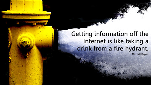
I found the image above using the Google search engine, I think that it is an excellent explanation of the internet's information overload. It also shows that many people feel the strains of an information overload. Some say that the continual overload of information will cause problems in society in the future, I am not sure I agree with that theory but I can understand why many people do.

I believe that one of the main concerns I think could go wrong with the information overload is to create a sensory overload.

Sensory overload = is a condition where one or more of the senses are strained and it becomes difficult to focus on the task at hand


I think that because the majority of the public are so used to seeing thousands of advertisements where ever they go, they will eventually become used to the adverts they come into contact with. This would begin to cause a lack of response throughout the target audience which basically registers the advertisement and graphics more or less useless.

I believe that over the years a fear of initiating a sensory overload has caused most advertisements and promotions to be very eye catching and as entertaining and appealing as possible. Most companies are in competition when trying to advertise their products because their target audience would be very similar to each other.

However, I believe that the internet is an excellent invention because you can learn absolutely anything at the click of a button; and at the moment I believe that even though the majority of adverts are exaggerated and over the top, we are not yet at risk of having a sensory overload. I do not think it is wrong to use the internet as a means of research and information because I have found that computer research has aided my learning and progress in every project.


On the other hand, even though the internet is an excellent source of research and information, there are many websites that are very misinformed so you have to ensure to check several different references so you do not risk finding an opinion online and using it as a fact in your work.

The information overload is not just a concern over the internet, every day I find numerous promotional flyers and cards in my porch and receive at least one cold call from a sales company that are trying to sell my some sort of product over the phone. Junk mail is becoming a growing problem because you can never be too sure what counts as junk mail. The majority of flyers and leaflets that come through my door go straight in the bin because they cause an unnecessary clutter, however; my email account is always bombarded with hundreds of junk emails daily. Some invite me to make thousands in minutes, others tell me that I have won some new, amazing prize and I mist click immediately to receive it, the majority of them are trying to sell something. I tend to ignore all junk emails because I get scared that if I open the wrong one, a virus would infect my computer and damage my hard drive..(which it has before.)

PART 2 - The rules of designs..

“Advertising is fundamentally persuasion and persuasion happens to be not a science, but an art.” - Bill Bernbach

In advertising not to be different is virtually suicidal. - Bill Bernbach


The quotes above explains that one of the most important things about advertising; that one of the main aims is to persuade the customer to purchase the product, using appealing advertising and a catchy strap line. The second quote explains that the most appealing advertising is usually the most different and unique style. Using Si Scott as an example; Scott's technique and style amazes and inspires me to develop my personal style. Scott's designs are very unusual and I find myself drawn into the image to study the detail in the design. I feel that I personally pay more attention to advertisements that grab my attention as I'm passing, something that makes me stop to have a closer look.


I also believe tat it is important to connect with your target audience, customers tend to respond more to an advert that releases some sort of emotion or feeling which means that there is a better chance that the advertisement actually got through to the customer and made them think.

There are countless rules to remember when it comes to design but I have found that the majority of artists and designers believe that the most important rule is not being afraid to break a rule when necessary. This allows the designer to think outside of the box, explore every option when creating new ideas, even if the outcome is quite shocking or seductive because most people take more notice when a designer begins to be creatively unique and pushes all boundaries.


An excellent example of the daring side of advertising is the NHS advertisement campaigns. Above I have inserted an image taken from the NHS 'hooked' campaign, this advert was designed to shock people and grab their attention and I believe that it has definitely succeeded there. The image itself is very graphic and quite disturbing because it looks very painful. Many people would be draw to the advertisement based on the image alone because it is quite repulsing but you can't look away.


Above I have inserted another advertisement from the NHS smoking campaigns, I believe that this image is also created to shock the viewer, but on a more emotional level as it involves a young child. I also feel that another possible target audience for this sort of advertisement is mothers, particularly mothers who smoke. Although this advertisement isn't gruesome or disturbing in a scary horrific way, it is disturbing in the sense that such a young child is affected and harmed by second hand smoke. This type of advertisement would evoke a more emotional response from the viewers because young children are so delicate, innocent and vulnerable.


Another interesting NHS campaign was to promote awareness about sexual health and STI's. Above I have inserted one of these advertisements, I believe that although the idea and design is quite simplistic it is disturbing enough to capture the viewers attention and possibly gain awareness. I think that it is quite disturbing to see a tag stitched onto the skin, labeling you with an STI for everyone to see. I feel like many women would see this advertisement and at a first glance they would see the male models muscular body and probably decide to take a second look. Only on closer inspection they would notice the tag and understand the main concept of the advertisement campaign.

PART 2 - Technology and Design

Today's technology is beginning to be associated highly when designing a new piece of work; there are so many adobe design software programs designed to aide and develop sketches. I find that by scanning and working digitally on a sketch/ drawing the quality and depth of the final image looks a lot more professional and clean. Computer technology allows us to clean up an image and add special effects and edit it in many ways.


Design and technology are one and the same in today's society, whether its watching and broadcasting a new viral advert or noticing promotional campaigns for a new car. There are several different ways technology helps people showcase their creative development, ideas and work online which allows the work to be seen by the public and whoever is interested.


I have found that as an artist the first and main thing I tend to look at are different ways of communicating to a specific target audience. The ways of communicating grows every day which means that there is a wide range, thats growing, of mediums and medias one can use to show progress an development.
Taking, for example the re-branding of a make up product that doesn't test on animals and is suitable for a female target audience,


I am learning how to use different design software at the moment and when I was asked to create this poster advertising a product that did not test on animals my group and I decided that it was best to try and keep the design quite simplistic. I mainly used Photoshop to create this piece but as I am beginning to learn about more Graphic Design software I do believe that Adobe InDesign and Illustrator would have enabled me to create interesting types of design work.

Viral advertisements are quickly becoming one of the newest and most popular forms of advertising and broadcasting a message across to the viewing public. Many of these advertisements gain fame by being posted and shared on websites like YouTube and Facebook; these type of ads also get recognition by word of mouth depending on how popular the advert is. The majority of viral advertisements are comical or designed to shock the viewers, whether it involves impossible stunts or disturbing themes and images which sort of seduces the viewer into paying attention. Designed to shock the viewers into watching the advertisements and maybe even re-posting it, which helps get customers excited about the product/ campaign in question.

http://www.youtube.com/watch?v=NB3NPNM4xgo

Above I have posted the link the the T-mobile 'Welcome home' viral advertisement because I think it is very catchy and memorable. Whenever I hear the song, I immediately think of T-mobile, which is exactly what the company wanted; for the customers to be reminded of the network every time they see the advertisement or hear the song.

PART 2 - Semiotics

Semiotics - The theory and study of signs and symbols, especially as elements of language or other systems of communication, and comprising semantics, syntactics, and pragmatics.


Semiotics is the study of signs and symbols, focusing specifically as a way to communicate using language and images. I have learnt that understanding the depth of semiotics is a very important aspect when trying to understand Graphic Design. It allows you to learn how to develop your problem solving skills to deal with problems that you will constantly encounter on the journey to becoming a designer.


We encounter a large amount of signs on a day to day basis, you can't really avoid them either, from road signs, to street signs and even shop logos and symbols. In today's society the thousands of signs and symbols and registered and understood as a sort of second nature to us.


Signs play a major role in every day life because we use them to do everything, they tell us where we can go, direct us to shops and stores, and they also help ensure our safety without having to read tons of writing; just by looking at a symbol you subconsciously register what the sign means.

Tuesday, 5 April 2011

PART 2 - Google It...

The internet is an amazing source of information which is growing every day. The vast majority of people today will turn to the internet as their first stage in many research projects because you can find pretty much anything on the internet.
The google search engine is easily one of the most well known sources of information; one simple search subject can receive thousands of results that aim to help you. However, most people these days are very lazy and can not be bothered to search manually through books when they can easily type what they want in Google and find what you want in seconds, literally. All the information you need is just one click away...

Sadly, over the years I have become one of those people, I don't see the point in researching through books for every piece of information when I can access the majority of it online. However, I do believe that books are an excellent source of information, especially when using quotes from a certain artist or author.
As soon as I begin a new project I turn to Google to help inspire myself and begin to gather secondary research to help generate new ideas. Google allows me to ensure that any ideas I have aren't already out there and if they are I can begin to change and develop my initial ideas.


An excellent example of how Google has helped me out was recently when I was required to work in a small group to create a campaign for a new brand of make up that did not test on animals. I used the internet to research existing companies that we could try to re-brand and I also looked into products that are not tested on animals and their logos and designs.


Si Scott

I really like looking at design and thinking: that attention to detail must have taken absolutely ages.


Si Scott is one of my all time favorite artists, his attention to detail amazes me and i love his style of creating an entire image using swirls and curls.
As a designer it is your job to be able to interpret and decipher different information and have the ability to design and create their idea in a new and interesting way, whilst still being able to make the message clear to the audience exactly what the client is trying to portray. I believe that Si Scott's work is completely unique and extremely eye catching, I also feel like it appeals to a large target qudience because it looks quite unusual and futuristic.

Rob Waller
“Documents need to
be considered in their
context: how they are
to be used and how
they relate to other
documents used within
an organisation.”
www.robwaller.org


Saturday, 27 November 2010

PART 1 - RVJ - Recorded Visual Journey

Key Principles

- Draw, Work By Hand
- Utilize Your Creative Brain


It is essential to use a sketchbook or RVJ to document all of your ideas and developmental aspects of research when working on a project. It allows you to create a process using visual imagery that expresses your feelings, thoughts, inspiration and imagination that is contained in a book.

Draw, Work By Hand


Drawing and working by hand is a crucial aspect of creating your RVJ as it allows you to engage a physical connection through drawing, rough sketches and consistent doodles; which are all a part of of your personal creative thinking. Its also a way to show your developmental process, and using visual imagery to document different types of research allows you to use other artists work and style as inspiration to develop your own artistic style.
However, documenting your ideas and progress in the RVJ is vital in the way of recording, it is also very important to be consistent in your development. Your findings must be organised in some way so the viewer understands the development as it progresses. Projects should be clearly separated and explained thoroughly.


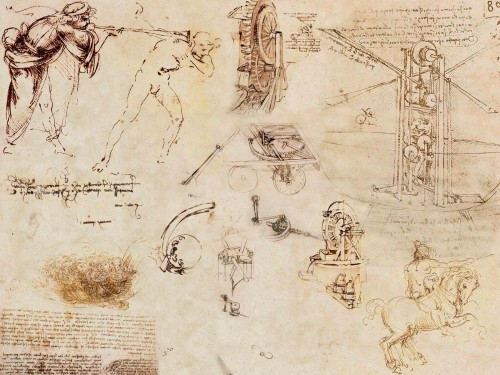
Leonardo Da Vinci is a legendary artist, his work have inspired many to create new and interesting forms of art.The piece above is a excellent example of creative thinking on paper. His sketches are quick but decisive; full of inventions, imaginative drawings and possible speculations of designs for machinery and various interesting products. His style is entirely committed to visual recording and creating development by drawing. Drawing is a way of transferring your ideas from your complex imagination and onto paper making it understandable for the reader and hopefully allowing them to gain a better insight into your personal style and way of thinking. By sketching and jotting down any ideas and developmental work; you are able to create a way to correct any problems or queries you have in the form of visual problem solving.
Your imagination never stops, because you are always thinking, so your mind is free to explore all possibilities and not limit yourself in your creative thinking.It is important to not forget your own judgement and to stop your inner child from exploring and imagining, because there are no barriers between child's play or mark making.


Lizzie Finn


Lizzie Finn has a very unique style of art; she uses a combination of sketches and fabrics along with a variety of decorative techniques within her work. She is able to produce very interesting imaginative pieces because she can work using a wide range of materials and mediums. She also seems to be able to experiment freely and enjoy the work she is creating, it is also and excellent method of creating developmental work based on basic ideas because the combination of sketches and fabric adds a unique twist to the work; even if its the most simple design.


Utilize Your Creative Brain


Learning how to manage your imagination and understand your ideas is extremely useful because it helps with your creative development, it also benefits you time management skills and it helps with your creative process.
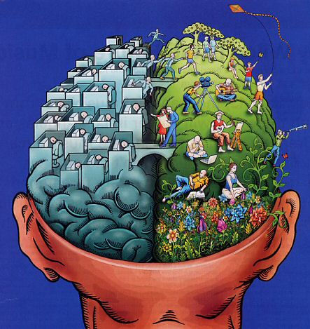
Our brain consists of two halves, the left and the right. Each side has special specific skills and abilities and the amazing way they function together enables us to understand what's actually going on.


Left Brain 'accountant' analyse


what is useful,? is it appropriate?


Analytical, observant, sensible, curious, enquiring, clarifying


Right Brain 'child' experimental play


play, fun, adventure, spontaneous, imaginative, carefree, experimental, innocent, curious etc.


I have inserted the images above as an example of the right and left brain, and the possible outcomes of the artistic talent of both sides.

We all can remember being a child, young and free to do whatever you wished. Everything we created was imaginative and freely expressed; when we were fully engaged with something to the point where nothing can distract us from our task; our inner child is allowed to roam free be as imaginative as possible at times where our left brain will encourage us to be cautious and more sensible about the content and presentation of our work.
The two halves of our brain function perfectly together, allowing us to think of imaginative outcomes and ideas. Being aware of which side of the brain we are operating in at each time is particularly useful because we then learn to utilize what is important, what has to be done next, and how to manage the entire project successfully. We constantly switch the sides of the brain we use at any one time; left to right, right to left, which allows us to ask ourselves questions about our work and figure out imaginative solutions to any problems we may face.

Monday, 25 October 2010

PART 1 - CONNECTIVITY

Notions of originality

Where do we draw the line when stealing someone's ideas?

Key Principles
Notions of Originality
Can recontextualised ideas be contemporary.


From a very young age we are taught how to observe and imitate artists throughout history, especially during our school education. We learn t do this by recreating the works and practises of artists who inspire and us and enable us to develop a personal style of our own.

In order to find any piece of historic art work that we could truly call original we would have to research back centuries; back to the time when the idea was fresh and new.


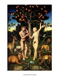
Lucas Cranach - Adam and Eve – c.1520’s

I have decided to use this image as an example of the notions of originality. The piece consists of Adam, Eve in the garden of Eden; the atmosphere of this piece is extremely calm and peaceful and I believe that this piece could be used to tell a story. This image has been recreated and modernized throughout the years but I believe that this may actually be the original. The calm atmosphere of this piece is quite inviting and encourages you to relax.


This is a image of the front cover of a magazine with a re-contextualised version of the above image. The colours are a lot more vibrant and eye catching to draw the viewer into the image and invite them to read the rest of the magazine. Even though the original image features animals around the figures of Adam and Eve, the magazine cover looks a lot more crowded. There is definitely a lot going on in this piece, I think that the atmosphere of this image is quite lively; even though the pose used is similar to the original image; there is a sense of movement or activity behind the camera.


Can Re-Contextualised Ideas be Contemporary?

I believe that re contextualised ideas can indeed be contemporary; depending on which medium is used so that connects it to today's society and culture.
Over the years, our technology has developed dramatically into a extremely powerful force. Technology is the new tool which allows us to push the boundaries of re-contextualised ideas.


Fashion is a form of art, trends go in and out of fashion, and most of the time they are re-visited throughout different generations and times, For example, Pop art, inspired by Andy Warhol is used again and again in many advertisements and works of art. Most modern designers re-vamp these sort of styles and use the inspiration to create their own personal style that they use to create a name for themselves in the advertising industry.

PART 1 - ITAP Lecture 3 Colette

>Key Principles

Legibility

- Legibility
- Visual Hierarchy


There are actually two types of type.

Text Type is designed to be legible and readable across a variety of sizes.

Display Type is designed to attract attention and pull the reader into the text. It can be more elaborate, imaginative, and have a stylish look.

Is the type on you have chosen legible?
Is it readable?
Do people have difficulty understanding your type?


I have inserted the image above as an example of illegible text; I found these newspaper articles by using the google search engine. I think that the text is illegible because the type face is an inappropriate size which makes is quite difficult to decipher and understand. The layout has been created to look very compact which could make the reader quite frustrated.
Most newspaper articles choose to stick to black and white colour because it is the most common and a well known combination. However, in this case, the black and white colour only adds to the reader's confusion, the letters look very jumbled together.


The above image shows an article that I consider to be legible because it is clear and easy to read. The article has been put together with the reader in mind, it even includes an image that provides visual stimulation that would encourage the viewer to read on. The bold type face immediately draws the reader into the article; as does the image used. I believe that all of the aspects of this article is indeed appropriate for the intended purpose.


Visual Hierarchy

The examples used above lead me to my second key point in this blog; Visual Hierarchy simply means what we do and see first. Visual Hierarchy, what is in the background of the piece and the foreground as well as focusing on the main subject of the piece.
Below I have inserted an example of Visual Hierarchy.


Vogue magazine covers are an excellent example of Visual Hierarchy because the readers attention is drawn; first and foremost to the image of Penelope Cruz, against the white background she almost jumps off the page to catch the viewers attention. The type face on this cover is very bold and eventually captures the readers attention, the cover looks very lively and I believe that it aims to target a young audience of mainly woman and teenagers and fashion figures.

Sunday, 24 October 2010

PART 1 -Research and Development from an Illustration perspective

Five key principles

Research: Through the ‘visual practice’ of observation, collecting, studying and exploring, illustration can contribute to a deeper understanding of the subject.

Practise: By understanding the various ‘practices of illustration’ one is able to progress and advance one’s own practice.

Inspiration: The notion of ‘inspiration’ derives from constant inquiry, based on research, observation, recording and experimentation.

Visual Vocabulary: The application and evaluation of drawing and media experimentation is key to the development of a ‘personal’ Visual Vocabulary.

Audience: An understanding and knowledge of ‘an audience’ can enhance and focus the communication.

The two key points I have decided to develop further are audience and research.

Research:

The two types of research are primary and secondary research.

Primary research (also called field research) involves the collection of data that does not already exist, which is research to collect original data. Primary Research is often undertaken after the researcher has gained some insight into the issue by collecting secondary data.

Secondary research (also known as desk research) involves the summary, collation and/or synthesis of existing research rather than primary research, where data is collected from, for example, research subjects or experiments


The main thing I learnt in this lecture is that research is continuous, it never stops. In order to further develop your personal style you must always observe what other artists and designers are creating, and you must also always remember to research what has already been done.

One of the main things to gain from collecting research is inspiration in others works, as well as ideas that help you develop your own imagination and a knowledge of past artists and your peers/ role models.
Everyone who pursues a career in art understands that most jobs target a specific audience and it is always important to create the right style of advert that relates to your audience.

Audience:

An excellent example of this sort of advertising is the different types of campaigns to stop smoking. These advertisements are usually very graphic; designed to grab the viewers attention immediately.

Mothers to be and mothers with young children:


For example, the NHS has created several advertisements to encourage people to stop smoking. Above I have inserted two advertisements designed to stop mothers smoking while pregnant and around their children. As you can see these advertisements are enough to shock anyone into quitting smoking. Most women who smoke while their pregnant do not believe that they are damaging their unborn child, the aim of this advert was to inform pregnant woman of the harm they are causing. The advertisement of the upset child breathing out smoke is especially disturbing, The fact that the child clearly looks distressed is quite unnerving, I believe that enough though these advertisements are upsetting; they are certainly very effective.

I decided to research more NHS smoking advertisements because I believe that they are the best example of working towards a specific target audience.

Men:


I believe that the NHS understand how to create advertisements that would shock the viewer into making a change to better their selves. I also believe that our technology will continue to advance and develop and allow us to create new methods and ways to target specific audiences in different and interesting way of advertising using different mediums.